Weekly Technical Market Outlook 8/18/2014

For last week, the S&P 500 ($SPX) finished up 1.22%, the Nasdaq ($QQQ) closed out the week at a new high with its 2.63% gain, and Small Caps ($IWM) closed on Friday just under their 20-week Moving Average and up 1%. This week’s Technical Market Outlook focuses on commodities and Treasury’s as well as the typical charts I show each week.
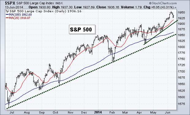
Trend

While we had that short-lived sell-off, the S&P 500 found support at its 100-day Moving Average and didn’t get the chance to even touch its trend line off the prior lows. The index is now back above both its short- and long-term Moving Averages as trend remains in favor of the bulls. I tweeted out on Friday the levels of resistance I’m watching, we were unable to close above either of them on Friday so I’ll continue to keep an eye here this week.
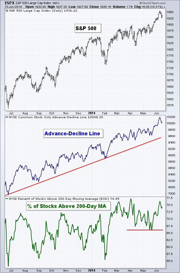
trend

Breadth

As we started into August I noted that there had been a small negative divergence that was created in the Advance-Decline Line. While these types of occurrences typically lead to lower prices, it wasn’t big enough to cause us to worry of a protracted decline. The drop two weeks ago took the A-D Line back to its trend line where it found support.

Breadth

Commodities

In my Where Are We In The Business Cycle? post back in December of last year, I showed the stock, bond, and commodity markets as I discussed some of the work done by John Murphy. While there are many different indices and ETFs that track the commodity market the GSCI Index is one of the broadest with a fairly long track record. However, I will say it gives a large weighting to crude oil. Earlier this year we saw $GSG run into its previous high which sent price falling and it has now broken through its bull market trend line.

This doesn’t mean that commodities are no longer in a bull market, but this is a fairly significant break and I’m watching to see how long it spends under the support line and if it now becomes resistance on any future advances. Commodities started out the year with a big move higher, but the last couple of months have not been kind. As we start to finish up the bearish period of seasonality, will commodities be able to rebound?

CommodityCommodities vs. Treasury’s

Sticking with the topic of commodities I want to show this next chart that has the ratio between The 10-Year Treasury and the CRB Commodity Index. You’ll notice this chart looks almost like a mirror image of the $GSG chart above. As Treasury’s rally the ratio between the 10-Year and commodities is close to breaking resistance. I’m curious if this will slow down the Treasury rally and if we see things cool off or if this ratio continues to march higher to the previous high in 2013.

comm treasuryMomentum

Like breadth, we saw momentum test support after the 4% drop in stocks. The Relative Strength Index fell back and tested previous support before bouncing and heading higher. After also diverging, the MACD has now seen a crossover of its fast and slow lines as stock prices attempt to rally back.

MomentumBond Market

The theme so far for 2014 has been bond divergence. The chart below shows the ratio between High Yield and Treasury bonds and then the 10-year Treasury yield along with the S&P 500. We haven’t seen this large of a divergence between these two bond measurements since prior to the 2011 correction.

In my opinion there’s one of two things that is happening right now as it pertains to stocks and bonds:

1. The bond is trying to signal that something isn’t right. While stocks have been taking out new highs, High Yield bonds ($HYG) have been taken to the woodshed relative to their perceived saver brethren, Treasury’s. During the current bull market when High Yield bonds and Treasury yield have headed to the exits in the face of an advancing stock market, it was the fixed income market that got things right. Is it different this time?

Or 2. The correlation between bonds and stocks is changing. The 30-week correlation between the S&P 500 ($SPX) and the 10-Year Yield ($TNX) is at the lowest level since 2006. While typically we seen bonds and stocks trade inverse from one another, historically that hasn’t always been the case. During much of the 90’s we saw interest rates fall while stocks headed higher.

Of course there could be a third option, that the bond market has things wrong and will correct as stocks stabilize and keep the up trend in tact. Luckily the “why” isn’t all that important for those that rely on price action to dictate their bias. However, what’s happening in the fixed income market is interesting and if you believe it’s sending a warning signal for stocks, then the chart below is pretty tough to ignore.

risk off60-Minute S&P 500

While there was a negative divergence in momentum going into the 4% sell-off, we also saw a positive divergence to help signal the ‘all clear.’ While price made lower lows on this intraday chart, the Relative Strength Index and MACD indicators began to rise, creating a bullish divergence. Price eventually confirmed and broke back over its 50 one hour Moving Average.

60minLast Week’s Sector Performance

Last week Health Care ($XLV) was the best performing sector followed by Tech ($XLK) and Consumer Staples ($XLP). While Energy ($XLE), Financials ($XLF) and Materials ($XLB) were the worst performing sectors for the week.

Sector performance 1 week

Year-to-Date Sector Performance

With the energy sector’s weakness over the last couple of weeks it has lost its place as one of the top two sectors for 2014. Health Care has moved into the top spot, followed by Utilities ($XLU) and Technology. Consumer Discretionary ($XLY), Industrials ($XLI) and Financials remain the worst performers for the year.

YTD sector perf


Disclaimer: Do not construe anything written in this post or this blog in its entirety as a recommendation, research, or an offer to buy or sell any securities. Everything in this post is meant for educational and entertainment purposes only. I or my affiliates may hold positions in securities mentioned in the blog. Please see my Disclosure page for full disclaimer. Connect with Andrew on Google+, Twitter, and StockTwits.

Weekly Technical Market Outlook 6/16/2014

I hope everyone had a good weekend. We’ve been having great weather here in Indianapolis, which has been nice after the awful winter we went through. It’s great to enjoy the summer before it gets too hot. 

Last week I mentioned that my mean-reversion indicator had 75% of its components flip negative. While we didn’t see aggressive selling, the S&P 500 ($SPX) finished the week down 0.68%, the Dow ($INDU) was off by 0.88%, and the Nasdaq ($QQQ) fell just 0.54% last week. Normally this bearish of a reading on this indicator is followed by larger drops in the equity market, so while this doesn’t dictate a larger move, I’ll be watching to see if selling pressure increases this week or if the bulls are able to regain control.

Trend

While we saw a small period of selling last week, it was less than 1% and the equity market’s up trend is still intact. I’ve added a short-term trend line to our chart below that connects the April and May lows. This could act as potential support if selling continues this week.

TrendBreadth

Like trend, the selling last week did not do much damage to the internals of the major indices. Both of our breadth measures are still well off their lows and continue to be in long-term and short-term up trends.

breadth

Volatility

The extremely low-level in the Volatility Index ($VIX) has garnered a great deal of attention lately and probably rightfully so. Tom McClellan wrote an interesting piece last week looking at prior market highs and the corresponding level of the $VIX. Tom states, “A low VIX is a sign of option trader complacency, and complacency is a problematic sign for the market which can lead to a price decline.  But when the VIX gets really REALLY low, the message changes.  Sure, it is a sign of an absence of worry, and a correction is possible.  But the really big price tops do not appear when the VIX is this low.”

Tom continues to discuss how in 2000 and 2007 the Volatility Index climbed from extremely low levels to an area closer to 16 when the equity market peaked. I’d also point out that while not an ‘official’ bear market, the intermediate top in 2011 was also accompanied by a $VIX reading of around 16, not an extreme low like we are seeing now. 

So while yes we’ll most likely see a rise in volatility eventually, history has shown that this low of a reading in the $VIX has not marked recent significant market highs. 

VIX

Momentum

Last week I wrote about the ‘overbought’ reading in the Relative Strength Index, this has now been worked off as price has weakened slightly. While ‘overbought’ readings can bring short-term weakness, it also tells us that there is a healthy amount of buying taking place in a market as momentum gets pushed up to these historically high levels – a bullish long-term sign. The MACD indicator hit its prior high and bounced lower and the Money Flow Index, like the RSI, worked off its ‘overbought’ status last week.

MomentumJune Options Expiration Seasonality

I’m a big fan of the Stock Trader’s Almanac as a great resource of historical market data. Recently Christopher Mistal wrote on the Stock Trader’s Almanac Blog about the bearish seasonality that occurs around June options expiration week. The one portion of his post that really stood out to me was: “The weeks after Triple-Witching Day are horrendous. This week has experienced DJIA losses in 21 of the last 24 years with average losses of 1.1%. S&P 500 and NASDAQ have fared slightly better during the week after over the same 24 year span, declining 0.8% and 0.2% respectively on average.”  

87.5% of the last 24 years have seen down week’s following June expiration week! That was pretty surprising to me. The table below shows you each year’s performance surrounding this specific time period going back to 1982.

June expiration60-Minute S&P 500

Not much to discuss on the intraday chart for the S&P 500. We had the RSI kiss the ‘oversold’ 30 level, giving bulls an excuse to step in and start buying again. We finished out trading on Friday just under the 50-1hr Moving Average, I’ll be watching to see if this short-term MA can be cleared to the upside or if it acts as resistance.

60 minRydex Money Flows

I found this pretty interesting. While we didn’t see massive selling last week, we did see the indices close in the red. But this didn’t prevent investors for pushing more money into the bullish Rydex funds, as shown by the red circle on the chart below. We can see that during the most recent drops in the S&P the percentage of assets in bullish funds had weakened each time. However, last week I guess was different. The small drop didn’t scare away the buyers and the ratio of bullish funds to Rydex assets advanced higher as it approaches its previous high set in May.

Rydex Fund Flow

Last Week’s Sector Performance

No surprise Energy ($XLE) was the best performing sector last week with Technology ($XLK) being the only other sector to outperform the S&P 500. Consumer Discretionary ($XLY), Industrials ($XLI) and Utilities ($XLU) were the worst performers for the week.

Week sector perf

Year-to-Date Sector Performance

Utilities continue to be the pest performer YTD. However, Energy is quickly approaching the leader, with Health Care ($XLV) sitting in a distant third. Consumer Discretionary remains the worst performer this year with Consumer Staples ($XLP) joining the ranks of under-performers, along with Industrials and Financials ($XLF)

YTD sector perf


Disclaimer: Do not construe anything written in this post or this blog in its entirety as a recommendation, research, or an offer to buy or sell any securities. Everything in this post is meant for educational and entertainment purposes only. I or my affiliates may hold positions in securities mentioned in the blog. Please see my Disclosure page for full disclaimer. Connect with Andrew on Google+, Twitter, and StockTwits.

Is A Cycle Peak Coming Later This Year?

I don’t spend much time looking at market cycles, but it seems there’s an important one that’s peaking out later this year. Readtheticker.com is a site that spends a great deal of time looking at market cycles. One specifically that has been brought up is the Kitchin Cycle.

According to Business Cycles and Depressions:

The Kitchin cycle is a cycle in the level of economic activity with a period of about 50 months or 3.5 years. It is named after Joseph Kitchin, a British statistician who identified both minor cycles of 40 months and  major cycles of 7 to 10 years. [….] Kitchin examined monthly statistics on bank clearings, commodity prices, and short-term interest rates in the United States and Great Britain from 1890 to 1922. All three series apparently moved together through 40-month cycles.

I’ve re-created the Kitchin cycle on the chart below. As you can see, the past four cycle peaks have lead to bearish periods of trading. We have the 2000 tech bubble top, the flat/down year in 2004, the 2007 peak, and the mini-bear market in 2011. If history continues to repeat itself, then the next Kitchin cycle peak will be later this year around July to September.

cycleI’m by no means calling for a market top later this year. I’m simply presenting one piece of data and you’re free to make you’re own conclusions. I continue to let price dictate my bias and will watch the market internals for clues to potential weakness in the current equity up trend.

Disclaimer: Do not construe anything written in this post or this blog in its entirety as a recommendation, research, or an offer to buy or sell any securities. Everything in this post is meant for educational and entertainment purposes only. I or my affiliates may hold positions in securities mentioned in the blog. Please see my Disclosure page for full disclaimer. Connect with Andrew on Google+, Twitter, and StockTwits.

Weekly Technical Market Outlook 12/23/13

So we got the Taper. Many traders believe that’s the only sentence we would need in evaluating the market right now. All that’s apparently mattered has been the Fed and they have finally begun to ease off the gas pedal. Many expected, myself included, that equities would sell-off on the news of the Fed tapering their bond buying program. This acts as a great example of when the consensus is this strong, the market moves the other way. In this case we saw equities head higher. With that, lets dig into this week’s Technical Market Outlook.

Equity Trend

The S&P 500 ($SPX) continues to look good with the up trend still intact. We hit a new 52-week high on Friday with traders reacting favorably to the Fed’s taper announcement. The major indices (Russell 2000, Dow Jones Industrial, Dow Jones Transport, Nasdaq, S&P 500, and EAFE) all finished the week above their short-term (20-day), intermediate (50-day), and long-term (200-day) moving averages.

TrendEmerging Markets

While the above mentioned indices look favorable, emerging markets have been struggling. Below is a weekly chart of the iShares MSCI Emerging Market ETF ($EEM). I last discussed this chart in October and mentioned the levels of resistance that emerging market bulls needed to break. Since then we have tested both resistance levels, both of which failed. $EEM is now back at its 200-week moving average with Friday’s close resting a few cents under the level of support. The previous low was at $40 and we’ll see if trading this week takes us back to this level and if buyers are able to step back in to stop the bleeding.

Emerging MarketsEquity Breadth

In a previous Weekly Technical Market Outlook I noted I was watching the 60% level for the percentage of stocks above their 200-day moving average (bottom panel of the chart). Last week we saw a test and slight break of 60%, however we closed the week back above and finished at 63.7%.

In both breadth metrics, the Advance-Decline line and the percentage of stocks above their 200-MA, a short-term divergence is taking place as the equity market hits new highs and breadth has been unable to confirm. I’ve put a red dotted line to show the divergences on the chart below. I’m more concerned with what’s taking place in the Advance-Decline line since it’s helped confirm the up trend for the better part of 2013 while the % above 200-MA has diverged since May. If we see the S&P 500 ($SPX) continue to rise this week then I’ll be watching to see if the advance-decline line can at least takeout its November high to show some level of positive equity participation.

breadthMomentum

It seems the theme for the last several months has been for the equity market to hit a new high and momentum to diverge. This theme continued to play out last week as well. We saw the S&P hit a new high and the Relative Strength Index (RSI) make another lower high. Divergences are also taking place in our two other momentum indicators – MACD and Money Flow Index.

momentumS&P 500 60-Minute

Wednesday’s Fed taper announcement pushed the equity market above our short-term resistance level. While price action was strong, the MACD histogram (bottom panel of the chart) began to make lower highs as it diverged from price. Although this is slightly concerning on the short-term chart, we did see confirmation in RSI (top panel of the chart) as traders pushed the momentum indicator above 70 – showing a strong sign of bullishness. If the divergence in the MACD histogram does in fact win out I’ll be watching the previous resistance level of 1810 and see if it can hold up as potential support.

60min

Last Week’s Sector Performance

Industrials moved into the top spot last week as traders continued the ‘risk on’ rally. Materials also put in a good week after being the second strongest sector two weeks ago. Utilities continued to lag.

weekly performanceYear-to-Date Sector Performance

No change to YTD sector leadership last week, consumer discretionary (cyclicals), health care, and industrials continue to lead the pack. While utilities, materials, and technology are still the weakest performers for 2013.

YTD performanceSentiment

My friend Ryan Detrick, who I mentioned last week on the blog as well, is the Senior Technical Strategist at Schaeffer’s Investment Research and put up an interesting chart of short interest on his Tumbr page. The folks at Schaeffer’s spend a lot of time looking through a contrarian lens when doing their analysis of the stock market. Signs of large short interest is viewed positively since this is essentially built-in buyers for a market or individual stock. Last week Ryan discussed two charts of Total Short Interest, one of those charts is below (the other was for QQQ and can be found here). What’s surprising is the fact that while the S&P has been rising, so has the level of short interest. Ryan notes that normally we don’t see short interest this high except at market bottoms – not new 52-week highs! As the chart shows, the two previous times we saw short interest this high was at the 2011 and 2012 S&P 500 lows. Ryan makes the argument that the potential short-squeeze  could provide the fuel to send equity prices higher.

short interestMajor Events This Week

Not a lot of news coming out this week and it’s to be expected that volume will be relatively low as traders take time off for the Christmas holiday.

Monday: Chicago Fed National Activity
Tuesday: Durable Goods Orders and New Home Sales
Wednesday: Christmas (U.S. markets closed)
Thursday: Jobless Claims
Friday: None

Don’t forget to vote daily for my blog for the TraderPlanet Star Award – Click here to vote!

Disclaimer: Do not construe anything written in this post or this blog in its entirety as a recommendation, research, or an offer to buy or sell any securities. Everything in this post is meant for educational and entertainment purposes only. I or my affiliates may hold positions in securities mentioned in the blog. Please see my Disclosure page for full disclaimer. Connect with Andrew on Google+, Twitter, and StockTwits.

Percentage Of Stocks Above Their Moving Average

I hope everyone had a good Labor Day weekend and is well rested for another exciting week in the markets. The topic of my TraderPlanet article for this week is a little different than what I normally write about. This week I take a look at one indicator, the percentage of stocks above a moving average, and two ways to apply it to the market.

Here’s a blurb:

Each day I look at hundreds of charts of different stocks, indices, indicators, and time frames to get a feel for what our firm should be invested in and where the risk is greatest within the global market. The percentage of stocks above their moving average can be a great tool in looking for confirmation of a move within equities as well as mean reversion with the market as a whole.

Source: Percentage Of Stocks Above Their Moving Average (TraderPlanet)

Disclaimer: Do not construe anything written in this post or this blog in its entirety as a recommendation, research, or an offer to buy or sell any securities. Everything in this post is meant for educational and entertainment purposes only. I or my affiliates may hold positions in securities mentioned in the blog. Please see my Disclosure page for full disclaimer. Connect with Andrew on Google+, Twitter, and StockTwits.