
I hope you all had a good weekend. I got a lot of great feedback from my Weekly Technical Market Outlook post from last week, so I’m happy you guys are finding this type of post useful. While the bulk of the categories I’ll cover will not change from week-to-week, I believe a level of consistency is important; I will try to add categories that I feel are important to cover as they pop up. With that said lets get into it…
Equity Trend
The trend for the S&P 500 ($SPX) continues to be up. Last week we saw a slight dip but buyers stepped in at the 20-day moving average to close out the week with strong move on Friday. I’ll continue to be watching the 20-day MA for short-term support on any further weakness.
 Equity Breadth
Last week we did not see much improvement in breadth, which is to be expected with the weakness we saw in the equity market for the bulk of trading.
The bottom panel of the chart below shows the percentage of stocks above their 200-day moving average. This measure of market breadth has garnered quite a bit of attention over the last few months. While the negative divergence is important to point out, the percentage itself is still north of 60%.
I reference 60% because that’s the level it was unable to get back above at the 2007 high. We saw the percentage of stocks above their 200-day moving average drop for nearly eight months before a top was put in for the S&P 500 ($SPX) in ’07. While we are presently approaching the same duration of deterioration, the percentage itself still shows the bulk of stocks in theoretical up trends (above their long-term MA). A break of 60% would also end the trend of making higher lows for the percentage above 200MA, and that’s when I think it’ll be time to start getting concerned. So while this metric of market breadth is worrisome, it’s not yet to levels I feel trigger a red flag.
 Equity Momentum
Nothing major happened in equity momentum last week. We saw the Relative Strength Index hold above 50 during the slight bout of weakness and the MACD and Money Flow indicators both dropped but aren’t sending serious warning signs. We still must contend with the negative divergence between momentum and price, especially if we see another lower high made in the RSI if the S&P makes a run at a new high.
 S&P 500 60-Minute
In last Monday’s Technical Market Outlook I discussed the negative divergence I was seeing in two momentum indicators (RSI and MACD) on the 60-min chart and that they could lead to lower prices in the short-term. The level of support I was watching was unable to hold as price fell to the November 20th low. Going into the short drop we had a negative divergence in the RSI indicator (top panel) and as price went lower we began to see a positive divergence in the same indicator. This helped act as kindling and the match that lit the fire to send stocks high being the non-farm payroll report on Friday. If things continue to improve I’ll be watching the 1810 and November high as possible resistance levels.
 Last Week’s Sector Performance
Below is a chart of the relative performance of the nine major S&P sectors for last week. The percentages shown represent the sector’s performance in relation to the S&P 500, not their actually return. As expected the defensive sectors lead last week, with utilities showing the strongest gain. It’s interesting to see health care be further back in the pack, away from its lower-beta counterparts.
 Year-to-Date Sector Performance
No big changes in sector strength year-to-date. The three strongest sectors are still health care, cyclicals (consumer discretionary), and industrials.
 Bonds
Bonds
The bond market had some interesting price action last week. The strong non-farm payroll data that showed unemployment had dropped to 7% in October sent the 10-year Treasury Yield ($TNX) up 21 basis points and above 2.9% intraday on Friday. However, we also saw a positive move for several bond ETFs. Junk Bonds ($JNK), 20+ Year Treasury’s ($TLT), and the Aggregate Bond Index ($AGG) all saw gains in the face of rising bond yields on Friday.
With that, I wanted to take a look at the chart for the 10-year Treasury Yield. We have an interesting level of resistance just a few basis points away. The blue line on the chart below creates a trend line off the 2010 and 2011 highs in yield. I’ve also marked the 2013 range with green dotted lines. To break out of this range we either need to see the 10-year yield get above (and hold) 3% or get down to 2.4%, which would be under the July and October ’13 lows.
 Sentiment
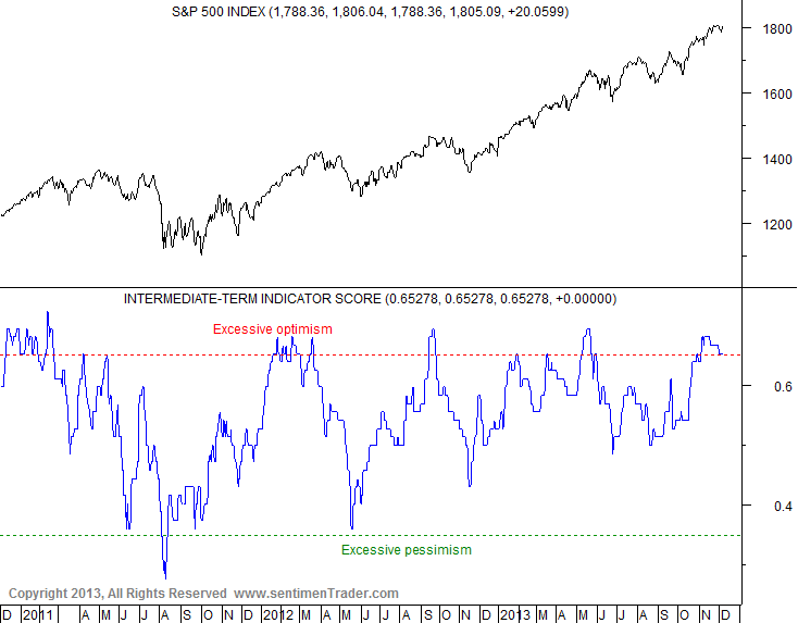
There are two sentiment-related charts I want to show this week. Both come from SentimenTrader, which is an excellent subscription service for sentiment data.
SentimenTrader has a set of indicators that are classified as intermediate-term (1-3 months). The chart below shows the overall composite score of those indicators, which includes for example COT data, AAII Survey, and option activity. This gives a good overall view of equity sentiment. As the chart shows, sentiment is still at elevated levels but only for the second time this year.
 Next is a bond sentiment chart, which uses data from the Rydex family of mutual funds. The chart below shows the percentage of assets held in bond bullish funds. As you can see, assets have been flooding out of the bullish bond fund and hitting levels not seen since at least 2010. We’ve seen many predominate economists and analysts turn bearish on bonds, and the data from Rydex indicates the individual investor has the same thinking. You’ll notice that previous low levels over the last year have not led to substantial bounces in bonds, which means we should not expect troves of cash to steer back into the bond market based on this set of data. However, this level of bearishness is important to keep in mind, especially as bond yields get close to testing resistance as I mentioned in the Bond section.
 Major Events This Week
This week doesn’t look to be a very data-intensive week. Here’s what is scheduled to be announced that traders may want to keep an eye on:
Monday: None
Tuesday: JOLTS (job openings) report
Wednesday: Treasury budget
Thursday: Jobless claims, Retail sales, and Business inventories
Friday: Produce Price Index
Don’t forget to vote for my blog for the TraderPlanet Star Award – Click here to vote!
Disclaimer: Do not construe anything written in this post or this blog in its entirety as a recommendation, research, or an offer to buy or sell any securities. Everything in this post is meant for educational and entertainment purposes only. I or my affiliates may hold positions in securities mentioned in the blog. Please see my Disclosure page for full disclaimer. Connect with Andrew on Google+, Twitter, and StockTwits.
Pingback: Andrew Thrasher on Market Breadth | The Reformed Broker