Dow Transports Lose Ground to the Industrials

The Dow Theory is something that’s often mentioned in market commentary and on the major financial news channel. At least one component of it is, the confirmation of new highs and lows by the Dow Industrial and Dow Transports. This mythology of using these two indices to provide insight into the ‘health’ of a trend has been around since the early 1900’s when first created by Charles Dow.

To start the month the Dow Industrial Average ($INDU) made a new high however, the Transports ($TRAN) did not confirm the move. Much speculation was passed around for the cause or whether the lack of a new high in Transports was sending a signal that the for the end of the current bull market. You can make up your own mind on whether that’s true or not.

Dow Transport

As far as the ’cause’ of the divergence we can look at momentum as a tool that helped show that may have been the outcome. Below is a weekly chart of the ratio between Transports and Industrials along with a 14-week Relative Strength Index (RSI), which measures momentum. Since November we’ve seen lower highs in the RSI indicator while the Transports led Industrials as shown by the green line rising. This bearish momentum divergence was sending a warning sign that the trend of out-performance for Transports may soon be coming to an end. And that appears to be what’ we are seeing now as Industrials have taken over leadership between these two major Averages.

For those that look for a reason in why markets act the way they do, this may help explain why the Dow was able to make a new high while the Transports have been unsuccessful in hitting one of their own.

Transport DIA

Disclaimer: Do not construe anything written in this post or this blog in its entirety as a recommendation, research, or an offer to buy or sell any securities. Everything in this post is meant for educational and entertainment purposes only. I or my affiliates may hold positions in securities mentioned in the blog. Please see my Disclosure page for full disclaimer. Connect with Andrew on Google+, Twitter, and StockTwits.

Weekly Technical Market Outlook 6/16/2014

I hope everyone had a good weekend. We’ve been having great weather here in Indianapolis, which has been nice after the awful winter we went through. It’s great to enjoy the summer before it gets too hot. 

Last week I mentioned that my mean-reversion indicator had 75% of its components flip negative. While we didn’t see aggressive selling, the S&P 500 ($SPX) finished the week down 0.68%, the Dow ($INDU) was off by 0.88%, and the Nasdaq ($QQQ) fell just 0.54% last week. Normally this bearish of a reading on this indicator is followed by larger drops in the equity market, so while this doesn’t dictate a larger move, I’ll be watching to see if selling pressure increases this week or if the bulls are able to regain control.
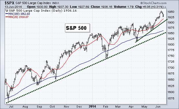
Trend

While we saw a small period of selling last week, it was less than 1% and the equity market’s up trend is still intact. I’ve added a short-term trend line to our chart below that connects the April and May lows. This could act as potential support if selling continues this week.

TrendBreadth

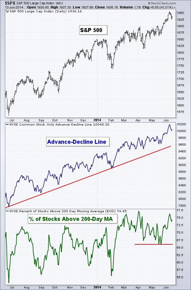
Like trend, the selling last week did not do much damage to the internals of the major indices. Both of our breadth measures are still well off their lows and continue to be in long-term and short-term up trends.

breadth

Volatility

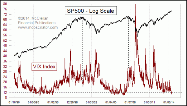
The extremely low-level in the Volatility Index ($VIX) has garnered a great deal of attention lately and probably rightfully so. Tom McClellan wrote an interesting piece last week looking at prior market highs and the corresponding level of the $VIX. Tom states, “A low VIX is a sign of option trader complacency, and complacency is a problematic sign for the market which can lead to a price decline.  But when the VIX gets really REALLY low, the message changes.  Sure, it is a sign of an absence of worry, and a correction is possible.  But the really big price tops do not appear when the VIX is this low.”

Tom continues to discuss how in 2000 and 2007 the Volatility Index climbed from extremely low levels to an area closer to 16 when the equity market peaked. I’d also point out that while not an ‘official’ bear market, the intermediate top in 2011 was also accompanied by a $VIX reading of around 16, not an extreme low like we are seeing now. 

So while yes we’ll most likely see a rise in volatility eventually, history has shown that this low of a reading in the $VIX has not marked recent significant market highs. 

VIX

Momentum

Last week I wrote about the ‘overbought’ reading in the Relative Strength Index, this has now been worked off as price has weakened slightly. While ‘overbought’ readings can bring short-term weakness, it also tells us that there is a healthy amount of buying taking place in a market as momentum gets pushed up to these historically high levels – a bullish long-term sign. The MACD indicator hit its prior high and bounced lower and the Money Flow Index, like the RSI, worked off its ‘overbought’ status last week.

MomentumJune Options Expiration Seasonality

I’m a big fan of the Stock Trader’s Almanac as a great resource of historical market data. Recently Christopher Mistal wrote on the Stock Trader’s Almanac Blog about the bearish seasonality that occurs around June options expiration week. The one portion of his post that really stood out to me was: “The weeks after Triple-Witching Day are horrendous. This week has experienced DJIA losses in 21 of the last 24 years with average losses of 1.1%. S&P 500 and NASDAQ have fared slightly better during the week after over the same 24 year span, declining 0.8% and 0.2% respectively on average.”  

87.5% of the last 24 years have seen down week’s following June expiration week! That was pretty surprising to me. The table below shows you each year’s performance surrounding this specific time period going back to 1982.

June expiration60-Minute S&P 500

Not much to discuss on the intraday chart for the S&P 500. We had the RSI kiss the ‘oversold’ 30 level, giving bulls an excuse to step in and start buying again. We finished out trading on Friday just under the 50-1hr Moving Average, I’ll be watching to see if this short-term MA can be cleared to the upside or if it acts as resistance.

60 minRydex Money Flows

I found this pretty interesting. While we didn’t see massive selling last week, we did see the indices close in the red. But this didn’t prevent investors for pushing more money into the bullish Rydex funds, as shown by the red circle on the chart below. We can see that during the most recent drops in the S&P the percentage of assets in bullish funds had weakened each time. However, last week I guess was different. The small drop didn’t scare away the buyers and the ratio of bullish funds to Rydex assets advanced higher as it approaches its previous high set in May.

Rydex Fund Flow

Last Week’s Sector Performance

No surprise Energy ($XLE) was the best performing sector last week with Technology ($XLK) being the only other sector to outperform the S&P 500. Consumer Discretionary ($XLY), Industrials ($XLI) and Utilities ($XLU) were the worst performers for the week.

Week sector perf

Year-to-Date Sector Performance

Utilities continue to be the pest performer YTD. However, Energy is quickly approaching the leader, with Health Care ($XLV) sitting in a distant third. Consumer Discretionary remains the worst performer this year with Consumer Staples ($XLP) joining the ranks of under-performers, along with Industrials and Financials ($XLF)

YTD sector perf


Disclaimer: Do not construe anything written in this post or this blog in its entirety as a recommendation, research, or an offer to buy or sell any securities. Everything in this post is meant for educational and entertainment purposes only. I or my affiliates may hold positions in securities mentioned in the blog. Please see my Disclosure page for full disclaimer. Connect with Andrew on Google+, Twitter, and StockTwits.

The Important Equity Level To Watch

Traders spend a lot of time in January discussing the “January Effect” and its impact on the full-year equity performance. While the accuracy of January on ‘predicting’ whether we’ll be in the green or red at the end of December has been historically high (88.9%), there’s a level I’m watching right now that has more implications in the coming months.

This is the topic of my TraderPlanet article for this week. Here’s a piece:

Now let’s move on to the lesser discussed topic that some may argue has a greater impact on intermediate-term returns. Also discussed in the Stock Trader’s Almanac is the December Low Indicator. Like the January Barometer, going back to 1950 when the prior year’s December low was taken out in the preceding year’s first quarter, the Dow Jones Industrial Average has dropped an average of nearly 11%. The most recent example of this was in 2010, from the point of breaking the 2009 December low, Dow dropped 4.8% before finding a new low in ’10. 2009 saw a 17.6% drop and 2008 (being exacerbated by the financial crisis) dropped 42% before making a year low after dropping below the respective past December lows.

Read the rest: The Important Equity Level To Watch (TraderPlanet)

Disclaimer: Do not construe anything written in this post or this blog in its entirety as a recommendation, research, or an offer to buy or sell any securities. Everything in this post is meant for educational and entertainment purposes only. I or my affiliates may hold positions in securities mentioned in the blog. Please see my Disclosure page for full disclaimer. Connect with Andrew on Google+, Twitter, and StockTwits.

Should We Stop Using Fibonacci Retracements?

One of the double-edged swords when it comes to technical analysis is the abundance of tools, indicators, and methodologies. I call this a double-edged sword because while the plurality of options in the tool box allows traders greater flexibility in developing a system or process that works best for them.  It also allows a greater ability for false security to be gained and money to be lost. While studying for the Chartered Market Technician I read numerous books that covered a vast amount of tools available to technical analysts. Some I use… some I don’t. It’s up to you (and me) as the trader to determine what we allow into our investment process.

This leads me into the discussion of Fibonacci retracements. The notion of Fibonacci numbers have been around for hundreds of years. It was brought into more established cultures by Leonardo of Pisa, who is known as Fibonacci. When applied to the financial markets there are three sets of numbers (viewed as percentages) used to find retracement levels: 61.8%, 38.2%, and 23.6%. Many software packages and website will add 50% to the mix, but this is actually not a Fibonacci retracement number but is the middle number between 61.8% and 38.2%.

Here’s a chart of the Dow Jones Industrial Average ($INDU) with a Fibonacci retracement overlay during the advance off the October ’11 low to the mid-2012 high. This would have been used to find potential support during the drop in May ’12. I’m not simply using this time period as an example because the Fibonacci levels did not act as support, I just picked a period of time to show how the retracement levels are used.

Fib on DowAdam Grimes, author of The Art and Science of Technical Analysis,  writes a very interesting blog looking at different aspects of charting. Recently Adam has dived into the math behind Fibonacci retracements and showed some surprising results.

Adam tested retracements using 600 stocks, 16 futures markets, and 6 currencies over a 10-year period starting in 2001 in order to capture different market environments. Adam writes at length about the study he performed but I’m going to discuss some of the highlights here today, but I encourage you to read his posts on the topic.

The table below shows  the results of Adam’s test of the average retracement made in each of the asset classes. As you can see over the 10-year period there was a very close mean between the three markets, however the random set of data also shows a close fit to 65% retracement. Also notice the standard deviation of 20.7%. Adam explains, “we can’t see any clear evidence of Fibonacci ratios in this table. The average retracement, around 65%, is not the Golden Mean, and the very high standard deviation means that we’re not even very “sure”, statistically speaking, that the mean is a valid measure.”

Test Results of Fib Adam GrimesNext Adam showed the retracements for each market on a histogram. If retracements worked, he points out, then we should see a cluster around the Fibannaci numbers commonly used as retracement support and resistance. But his is not the case. For all three asset classes, as well as the random data set, there does not appear to be clear bias to any one or multiple numbers.

Histogram fib Adam GrimesAdam concludes that mathematically it does not make sense for traders to use Fibonacci retracements when trading. So why do traders use them?

Here’s Adam’s thoughts:

People like mystery and intrigue, and I think the idea that your trading system somehow rests on the harmonic convergence of the Sacred Geometry of the Pillars of the Universe […] appeals to a certain mindset—people will overlook the aberrations of the Gann/Elliot/Fibonacci crowd.

[…]

There is also something reassuring about being able to forecast exact turning points to the tick, even if there is no validity to those forecasts. If you make enough predictions, some of them will work out just by chance, and that’s all you need to embed a pretty deep cognitive bias.

So with this, will I stop using Fibonacci retracements in my analysis? I’ve never been one to put all the weight on a single tool or methodology and by no means would I trade off a retracement level. I will have to do more of my own research before making my personal conclusion. However, I think this type of research is important and we as traders should always be challenging what we see and read. I will admit I now do view retracements in a different light. It’s hard to ignore this type of study and its results.

I write this post not to condemn those that use Fibonacci numbers. I simply found Adam’s work very interesting and worth sharing. You can make your own judgments and conclusions.

Source: Testing Fibonaccis (Adam Grimes) and Fibonacci Conclusions (Adam Grimes)

Don’t forget to vote for my blog for the TraderPlanet Star Award – Click here to vote!

Disclaimer: Do not construe anything written in this post or this blog in its entirety as a recommendation, research, or an offer to buy or sell any securities. Everything in this post is meant for educational and entertainment purposes only. I or my affiliates may hold positions in securities mentioned in the blog. Please see my Disclosure page for full disclaimer. Connect with Andrew on Google+, Twitter, and StockTwits.