Daily Volatility Needs To Calm To Draw Back Equity Buyers

2022 has been a very volatile year despite what the Volatility Index may show. This has caused many active investors and traders a great deal of frustration as they attempt to set their sights on a spike in the VIX to signal the “all clear” that the bear market has ended. This belief that the VIX must spike to mark a bottom has established as a criterion due to its common occurrence during most declines in stocks. However, like all market axioms, it’s not a requirement and market will do as it pleases to cause the most frustration possible! Charlie Bilello put out a great table showing that the S&P 500 has declined between 1% and 2% 29 times this year, the most since the Financial Crisis in 2008. The high number of daily swings that exceed 1% in both directions is a common characteristic of a bear market and is a development that we need to see end in order most likely to entice buyers to regain control of the tape in any meaningful fashion.

The spot VIX chart, shown below, hasn’t gotten above 40 during the current down trend – leaving many investors scratching their heads. Over the last decade readings in the 40s and even 50s were common markers of equity lows – or approaching low. The market this year has been more “orderly” but not without its fair share of daily volatility. The caveat being that daily volatility has come in both directions which is likely what’s helped keep a proverbial lid on the Volatility Index.

Below is a look at the number of days over the last 6-months we’ve seen the S&P 500 index advance or decline by 1+%. As of Weds., we’ve had 60 +/-1% days. This rolling figure peaked in July at 66, the most since the Covid Crash and before that, 2012 and 2009. Following the Financial Crisis we had over 90 days of +/-1% moves and in 2002 it peaked at 82 days. As we can see on the chart below, we’ve had an increase in daily volaltity, since it hasn’t occurred as a string of large down days – which would be like fuel for the VIX – the Volatility Index has not had a chance to experience a midlife crisis and instead has spent most of 2022 enjoying its 20s and 30s.

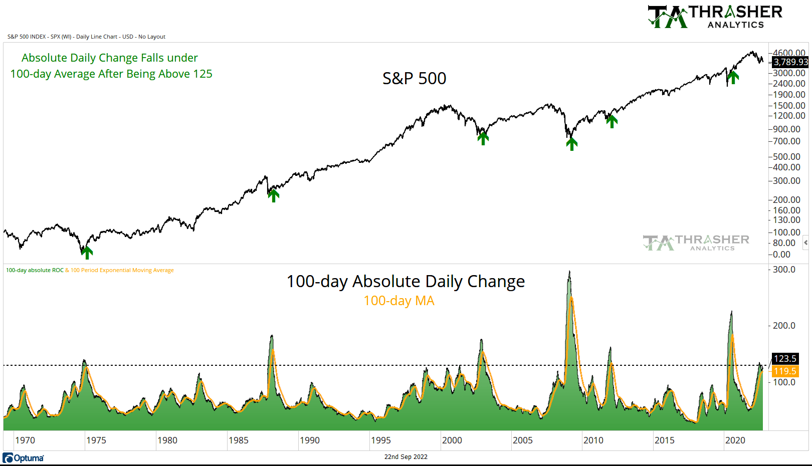
Rather than have tunnel vision on the absolute level of the spot VIX, I focus on the actual volaltity of the equity market as well. A concept that I believe was popularized by Ned Davis Research involves monitoring the 100-day cumulative absolute daily change as a gauge of market volatility. This is plotted on the chart below, along with the 100-day average of this data set. Since the 1970s, a common marker of markets shifting from bear to bull market has been a calming of daily activity. Market declines during this 50 year period all saw the cumulative total of daily change fall from a high of over 125 to under the intermediate average.

Historically, we haven’t seen a decline the size we’re experiencing today end without an end also to large daily moves. Fewer daily swings allow investors to wade back into the waters, no longer fearful of being smashed by a wave of volaltity. Currently, we’ve seen the cumulative 100-day total peak above 125 but it’s yet to cross under the intermediate average. We’re close! …But not there yet. I’ll be watching, and sharing in my weekly Thrasher Analytics letter, how this chart develops and when we begin seeing calmer waters develop.

Disclaimer: Do not construe anything written in this post or this blog in its entirety as a recommendation, research, or an offer to buy or sell any securities. Everything in this post is meant for educational and entertainment purposes only. I or my affiliates may hold positions in securities mentioned in the blog. Please see my Disclosure page for full disclaimer.

Bullish Divergences Build in Energy Market

When we talk about “energy” we often are referring to both the sector and the commodities as they often move together in the same direction. When oil and natural gas are rallying, the stocks of the companies that are involved in their sale and exploration often are going higher as well, and vice versa. However, there are times where the correlation breaks, which we’re seeing right now with energy stocks showing strong recent performance as oil prices struggle.

Energy Sector Performance
As for energy stocks, they’ve been the strongest corner of the equity market. Here’s the YTD and 1-year performance of the S&P sectors.

Stocks vs. Commodity
Below is a look at the Energy Sector (XLE) and Crude Oil. Both saw strong up trends at the start of the year and after a stumble in June, energy stocks have resumed going higher. In fact, XLE is the best performing sector by a long shot, up nearly 40% YTD. But look at Oil. It’s continued to move lower.

Energy stocks aren’t the only area of the financial market we’re seeing up trend against a weakening commodity.

Below we have the Crack Spread, the spread between the price of a barrel of crude and the price of produced refined from oil. Typically, the Crack Spread moves with the price of oil. Similar to energy stocks, the Crack Spread peaked in June but did not make a lower-low, instead it tested its prior low and bounced higher (blue arrows) and is close to rallying back to its prior high.

Here’s the same chart as above but with a historical study shown in green of when the Crack Spread was in the upper 80th percentile of its historical range while oil was in the bottom 40th percentile. Since 2010, when the Spread was showing strength relative to crude, the price of oil often played “catch up.” November ’14 was the exception, as crude continued to decline

Looking For The “Why”
What’s likely the likely cause of the break in correlation? In August, Bloomberg ran an interview with the Saudi Energy Minister, who cited the dislocation paper and physical markets. Suggesting the need for OPEC to cut production to bring the two markets more inline.

Saudi Arabian Energy Minister Prince Abdulaziz bin Salman said “extreme” volatility and lack of liquidity mean the futures market is increasingly disconnected from fundamentals and OPEC+ may be forced to cut production.

“The paper and physical markets have become increasingly more disconnected,” he said in response to written questions from Bloomberg News. 

Paulo Macro has some great threads on Twitter as well looking at changes in the COT data, specifically the large drop in Open Interest and Net-Longs.

Energy Sector Valuation
Has the strength in energy stocks caused the sector to become ‘overvalued’ (if you’re into that kind of analysis)? Based on the work by JPM, no. Instead, JPM shows the spread in the energy sector’s forward P/E vs. the broad market has never been lower in thirty years.

European & American Energy Crisis
Meanwhile, the crisis in Europe continues to intensify and is only being made worse (in my opinion) by the government attempts to treat the symptoms instead of the cause of the pain. Most recently, the inflation rescue package which will simply increase demand and put more pressure on prices to rise. Household energy costs in Germany are up 43% YoY. Gameshows in the UK are now a “Wheal-of-Fortune” type game to pay off viewers electric bills. It’s not just household energy costs that are squeezing Europeans. Farmers in Europe are facing natural gas bills that have gone from are up 17x. In Italy, consumers are publicly burning their energy bills in protest of rising prices.

Americans are also feeling the squeeze with 1 in 6, which equates to 20 million homes, falling behind on their utility bills according to the NEADA. The chart below from Bloomberg shows the average American has seen a 15% rise in prices from last year. In California, consumers have experienced a 40% rise since Feb. 2020.

All of this has occurred before Russia turned off Nord Stream 1 and stopped the flow of natural gas to Europe. Klaus Meuler, the president of the Fed’l Network Agency said that while gas storage is 95% full, Europe is still just 2.5 months of demand. What’s the worst case scenario? That the rise in energy prices becomes Europe’s “Lehman moment” and begins a domino effect of companies going under. In July we saw Germany bail out Uniper with a 15 billion euro ($15.2 billion) rescue package. Several European countries are now discussing or have already implemented price caps on utilities. In the U.S., the government continues to empty its reserves with the SPR falling to the lowest level since 1984.

What’s the bearish argument for oil?
Demand destruction. We’re not likely to see the energy crisis be resolved from the supply side outside of some massive coordinated effort by OPEC and/or Russia leaves Ukraine and their flows to Europe return to normal. Instead, prices could continue lower if demand dries up which would likely be associated with an economic slowdown that puts pressure on not just commodity prices but all financial markets. And even then, the drop in demand would need to outstrip the crisis on the supply-side.

What’s Next
From here, I think we could still a rise in energy markets and the respective energy commodities. European governments will continue to put band-aids on the crisis that throw more fuel on the fire than extinguish it. However, I’m a technician first and will allow price action to dictate my bias. I think the divergences in the Crack Spread and Energy Sector are bullish for oil, natural gas, and gasoline.

Disclaimer: Do not construe anything written in this post or this blog in its entirety as a recommendation, research, or an offer to buy or sell any securities. Everything in this post is meant for educational and entertainment purposes only. I or my affiliates may hold positions in securities mentioned in the blog. Please see my Disclosure page for full disclaimer.