
Sorry for getting this post up a little later than normal. My birthday was on Sunday so I was out with friends most of the weekend, leaving me little time to write. Nonetheless, while shorter than normal I’m still getting my charts updated and will be back will a ‘fuller’ version of the Weekly Technical Market Outlook next week.
Equity Trend
While the S&P 500 ($SPX) closed just slightly in the red during the shortened trading week, we are still in an up trend for the equities market. All eyes are on 1850 as bulls will be biting at the bit to set a new high.

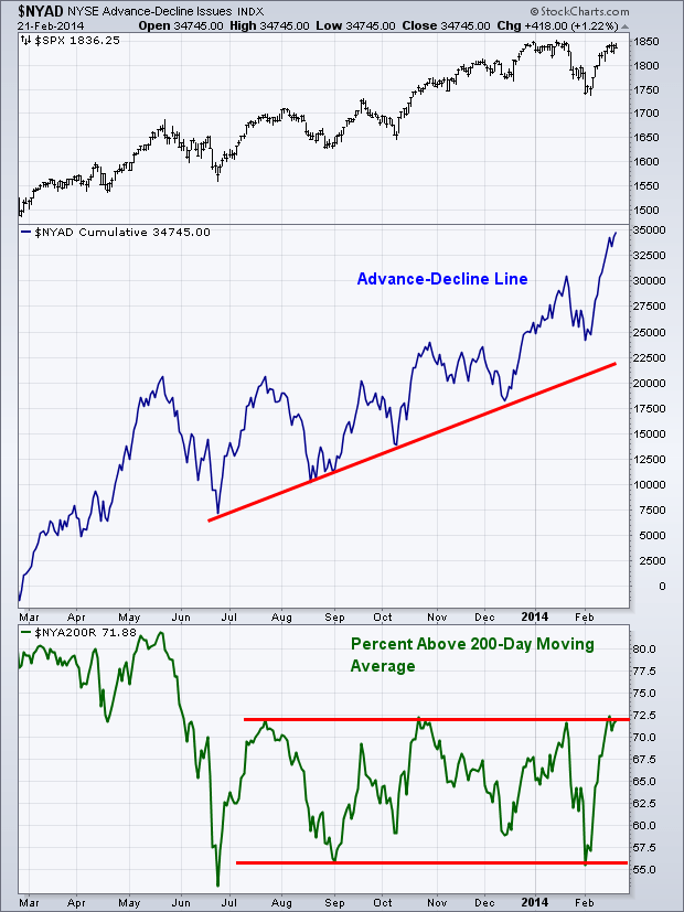
Equity Breadth
Last week produced some more strong trading sessions in respect to market breadth, with the Advance-Decline Line setting another new high. While the underlying indices are still battling with resistance we are seeing a larger amount of NYSE stocks staying in the green, which is what’s pushing this measure of breadth higher. The Percentage of Stocks Above Their 200-day Moving Average indicator is still in its range. We were unable to see a break of 72.5%, which is what’s needed to get us above the previous three highs since last July.
 Equity Momentum
We are still seeing some signs of struggle in our momentum indicators. As previously mentioned, the S&P 500 ($SPX) has yet to set a new high, but at least it’s gotten close. We can’t say the same for the Relative Strength Index which hasn’t even broken 65. As I wrote in last week’s Technical Market Outlook, the market was able to work through these divergence throughout 2013 trading as price marched higher, but the sign we need for this pattern to continue in 2014 needs to come from market breadth. If we can get more stocks confirming the up trend then it makes it easier to ‘forgive’ momentum from being weak. However, if both momentum AND breadth begin to weaken, then that’s when we’ll start raising a red flag.

Business Cycle
At the end of last year I wrote a post called Where Are We In the Business Cycle? As the asset classes have improved, I wanted to show an updated chart from that post. In the post from December I showed how bonds ($USB), stocks ($SPX), and commodities ($GSG), performed going into the previous two market peaks. At the time we were seeing commodities flirting with its bull market trend line, as well as bonds experiencing a bout of weakness. With the resurgence of buyers stepping into the bond pits, and commodities showing signs of a rebound, all three asset classes continue to hold their up trends, which is positive for the current business cycle.

60-Minute S&P 500
I’m glad to see futures positive this morning, because the short-term chart for equities doesn’t look great. As I’ve mentioned, we struggled with setting a new high last week putting in a potential short-term double top at 1846 with the Relative Strength Index and the MACD putting in bearish negative divergences. We did see support come into play with the 50-1hr Moving Average, which held off sellers last week. If we see continued selling I’ll be watching to see if this moving average can hold once again or if we begin to head lower and test the previous low of 1810.

Last Week’s Sector Performance
Last week we saw energy ($XLE) continue to show strength as it came in on top for the second week in a row. Health care ($XLV) and utilities ($XLU) also showed strength while the overall equity market closed out the week slightly in the red. Once again, the financials sector ($XLF) was the worst performer during trading last week.
 YTD Sector Performance
So far 2014 trading as shown a strong bias to the defensive sectors, with utilities ($XLU) and health care ($XLV) continuing to be the stars YTD. Interestingly, the consumer staples sector ($XLP) is acting as the ugly step child of the defensive portion of the market, straying away from its two counterparts as it has now beaten out energy as the worst performing sector year-to-date.

Major Events This Week
While not an often discussed economic data set, this week we get the Chicago Fed National Activity Index, which in my opinion gives a great read to where we are with respect to economic growth. Q4 2013 GDP data comes out on Friday which will garner much attention as the week progresses.
Monday: Chicago Fed National Activity Index
Tuesday: S&P Case-Shiller Home Price Index
Wednesday: New Home Sales
Thursday: Jobless Claims and Durable Goods Orders
Friday: GDP and Pending Home Sales
Disclaimer: Do not construe anything written in this post or this blog in its entirety as a recommendation, research, or an offer to buy or sell any securities. Everything in this post is meant for educational and entertainment purposes only. I or my affiliates may hold positions in securities mentioned in the blog. Please see my Disclosure page for full disclaimer. Connect with Andrew on Google+, Twitter, and StockTwits.


