
Something just don’t feel right about the current rally to new highs. We are beginning to see signs of deterioration while at the same time not the same characteristics that have been present at previous bull market peaks.
For instance, momentum is creating a negative divergence on the daily chart but not the weekly. The Advance-Decline Line didn’t confirm the most recent high but the divergence is minor and not as large as in 2000 or 2007. Margin debt has begun to turn lower over the last several months, but we have continued to see the Dow Industrial and Transport Indices confirm the new highs each have been making. If we do begin to correct, which I think is possible (anything is possible!). I would be surprised if it turned into a bear market. Corrections are healthy and part of an up trend. We’ll see what price brings us.
Trend
As I wrote last Wednesday, Trend matters and isn’t something we should forget about. The S&P 500 ($SPX) continues to be in an up trend as price remains above the 100-day Moving Average, 20-day Moving Average and both the short-term and long-term trend lines.
 Breadth
While the S&P 500 ($SPY) may have made a new high last week, breadth did not confirm. Both the Advance-Decline Line and the Percentage of Stocks Above Their 200-Day MA were off their respective highs as the equity index broke to a fresh level. The A-D Line finished out last week at its short-term up trend line, which keeps breadth in the bulls favor but just barely.
 Nasdaq Participation
This next chart comes from Dana Lyons which is a must follow on Twitter. This chart looks at the Nasdaq 100 index ($QQQ) going back to 1998 while also showing the percentage of Nasdaq stocks making new highs at the same time of the underlying index. As Dana points out, last week’s new high saw the fewest new highs in the stocks that make up the index. This is not what bulls want to see.
Based on Dana’s calculations, even in 200 when breadth was awful and there was very little participation in the up trend by individual equities, there were more than there is today. That’s pitiful.

Momentum
Like Breadth, we have a negative divergence in the Relative Strength Index as this momentum indicator made a series of lower highs going into last week’s new high for the S&P. We also have a divergence in the MACD and Money Flow Index indicators.
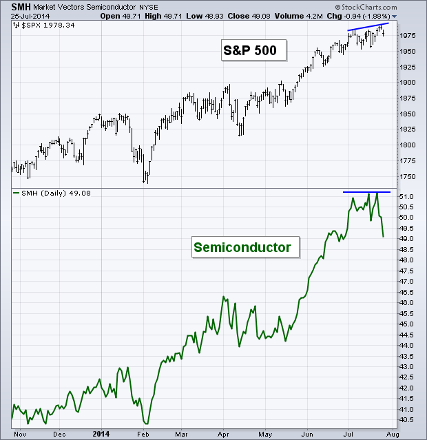
 Semiconductors
In the webcast I did with MarketWatch in early June I said that one of my favorite indicators to watch was the Semiconductor sector ($SMH). I like to see semi’s confirm the price action that takes place in U.S. equities. While 2014 has been the year of “new highs in stocks” we’ve seen the semiconductor sector market right along hitting new highs as well. Until last week.
Last week I tweeted out a similar chart to the one below, showing that semi’s were not confirming the new high. As of the close on Friday, $SMH has wiped out all of its July gains. We don’t normally see this type of behavior and this kind of divergence unless stock prices are preparing to head lower. Do semiconductors always foreshadow corrections in stocks? No, nothing is perfect. But based on the small bit of weakness we saw in the S&P on Friday, I think it’s possible we start seeing equities chase after semi’s.
60 Minute S&P 500
On the intraday chart of the S&P 500 we can see negative divergences was created as the RSI and MACD indicators made lower highs as the S&P made a new high. This was then followed by price dropping back below the prior high.
 Last Week’s Sector Performance
Once again the Energy Sector ($XLE) led in relative performance for the week. Followed closely by Technology ($XLK) and Health Care ($XLV). The Consumer space got hit with Consumer Staples ($XLP) and Discretionary ($XLY) the two worst performing sectors last week.
 Year-to-Date Sector Performance
Utilities ($XLU) and Energy are still the two leading sectors for 2014. Tech, Health Care, and Materials ($XLB) round out the group of sectors that are still outperforming the S&P 500. Consumer Discretionary and Industrials ($XLI) are the worst performing sectors YTD.

Disclaimer: Do not construe anything written in this post or this blog in its entirety as a recommendation, research, or an offer to buy or sell any securities. Everything in this post is meant for educational and entertainment purposes only. I or my affiliates may hold positions in securities mentioned in the blog. Please see my Disclosure page for full disclaimer. Connect with Andrew on Google+, Twitter, and StockTwits.
Pingback: Weekly Technical Market Outlook 7/28/2014 – Andrew Thrasher | Marty Investor
Pingback: Hot Links: Possibly Imminent | The Reformed Broker