Breadth For The 9 S&P 500 Sectors

Below are the charts showing price (most charts are price only and not dividend adjusted outside of $XLF, which is divided-adjusted) as well as the sector’s respective Advance-Decline Line. The Advance-Decline Line is one of the most commonly used tools to measure the breadth, which is just a fancy way of saying participation, within a market. A-D Lines simply measure the cumulative number of underlying stocks that are rising or falling. When a sector is hitting new highs, ideally you want its breadth measurement to also be in a strong up trend and hitting new highs. It’s when these two diverge that we see a warning sign that the trend may be changing as the level of participation by individual stocks is not showing strong support.

Health Care
The SPDR Health Care ETF ($XLV) is currently trading in a consolidation pattern with resistance around $71.50 and support of a rising trend line connecting the prior higher lows. The A-D Line for Health Care is near a new high and has shown a solid level of support by the underlying health care stocks.

Consumer Staples
$XLP has been in a down trend since its mid-2016 peak, however price has recently broken above the declining trend line as buyers have re-entered the market for consumer staple stocks. The A-D Line for $XLP has been showing a greater sign of strength having risen back to its prior high and is ready to potentially breakout.

Utilities
The utilities sector ($XLU) has been improving since November but still well off its mid-2016 high. Breadth has maintained its up trend for $XLU, not putting in any lower lows like price has over the last 6 months.

Materials
The materials sector has been in an up trend since its early-2016 low and is currently testing a trend line off its intermediate low from November. $XLB’s A-D Line test its prior high but was unable to break out like price had last month.

Consumer Discretionary
$XLY has been setting new highs after putting in an intermediate low in November. However, its Advance-Decline Line has not been able to breakout quite yet – still sitting under its prior August high.

Energy
$XLE had a strong 2016 after declining for several years. However, it’s A-D Line has not been seeing the same level of strength, creating a bearish divergence since for the last several months. While the sector has been rising, it appear many individual energy stocks have not been as lucky.

Financials
Financials have been one of the strongest sectors since the November U.S. election. Price has been attempting to set a new high and the sector’s A-D Line has been support of that attempt, remaining strong and confirming price’s advance.

Industrials
Similar to $XLF, Industrials have been quite strong since the November election with price hitting new 52-week highs. $XLI’s A-D Line has continued to confirm the moves made in price.

Technology
Finally, the last of the S&P sectors and one of the strongest of the group. Technology has continue its up trend and practice of hitting fresh new highs. Fortunately, the A-D Line has continued in its up trend as well. While the A-D Line hasn’t quite broken out like $XLK has most recently, it is very close to doing so.

Update: While Real Estate has been added as a sector, I unfortunately am unable to find an advance-decline line for it, so it has to be left out of this post at this time.

Disclaimer: Do not construe anything written in this post or this blog in its entirety as a recommendation, research, or an offer to buy or sell any securities. Everything in this post is meant for educational and entertainment purposes only. I or my affiliates may hold positions in securities mentioned in the blog. Please see my Disclosure page for full disclaimer. Connect with Andrew on Google+, Twitter, and StockTwits.

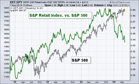
The Retail Index Continues to Get Pounded

I’ve been discussing the consumer sector of the market recently, looking at Consumer Staples ($XLP) relationship to the S&P 500 and the divergence in momentum that’s lead to substantial weakness in previous years.

However, today I want to take another look at the relationship between the broader S&P Retail Index ($XRT) and the S&P 500 ($SPY). Typically we see the ratio between the retail space and the S&P track along with the overall equity market. In 2013 the 60-day correlation between the ratio and the market was 0.87, a sign that things were healthy and the up trend was being confirmed. The current correlation is -0.36, something isn’t right. Like I showed with the Relative Strength Index for the ratio between $XLP and $SPY in my Technical Market Outlook this week, the consumer segment of the market, shown today through the S&P Retail Index is showing signs of worry.

Mr. Market is trying to tell us something right now, and it seems he’s choosing to do it through the Retail sector, and specifically Consumer Staples. The divergence that’s taking place as the chart below shows is worsening. The 60-day correlation has not been more negative than it is today since 2007. As we enter the tumultuous period of seasonality, yellow flags (and some may feel they are red flags) are popping up and are becoming hard to ignore.

xrt spy

Disclaimer: Do not construe anything written in this post or this blog in its entirety as a recommendation, research, or an offer to buy or sell any securities. Everything in this post is meant for educational and entertainment purposes only. I or my affiliates may hold positions in securities mentioned in the blog. Please see my Disclosure page for full disclaimer. Connect with Andrew on Google+, Twitter, and StockTwits.

Weekly Technical Market Outlook 4/14/2014

Selling continued last week with the Nasdaq taking the brunt of the damage being off 3.10%, the S&P 500 down 2.65%, and the Dow down 2.35%. While the selling continued into the final hours on Friday, it appears the selling was strongest on Thursday, where we saw a larger share of volume and issues declining compared to Friday. We closed out the week with the S&P 500 under its lower Bollinger Band. We saw this occur four times in January before the buyers stepped back in and took the equity index higher.  At the end of trading on Friday we had six of the nine S&P sectors trading under their 50-day Moving Averages, at the January low all but utilities were under their respective 50-day MA.

Equity Trend

With last week’s selling we saw the S&P 500 break through the level of support I highlighted last Monday as well as its 100-day Moving Average. We are still 15 points away from the up trend that’s kept many traders bullish for the last five months. If we see the S&P continue to fall, I’ll be watching this trend line as the next level of potential support.

Trend

Volatility Backwardation

On Friday I tweeted out a chart of the $VIX futures curve and mentioned that April prices were now trading at a premium to May and June, which puts the $VIX into backwardation. This typically happens when option traders become more fearful of short-term volatility than longer-term price swings and has been a fairly good indicator of short-term bottoms in the equity market. Below is a chart of the ratio between the one-month $VIX and the 3-month $VIX in histogram form. When a bar breaks above 1.0 we know that the 1-month is trading above the 3-month (i.e. backwardation).

BackwardationS&P SKEW

Sticking with our fear/risk theme, I noticed an interesting development in the S&P SKEW index. SKEW attempts to measure the ‘tail risk’ within the options market. As the chart below shows, we’ve seen spikes in SKEW prior to previous short-term declines in the S&P ($SPX). For instance we saw a break of 135 prior to the drop in 2012 and more recently we saw SKEW begin to rise again over 135 in December, January, and February. However, we did not see SKEW rise prior to or during the most recent bout of equity weakness. It does not seem that option traders felt this was going to be a 2+ standard deviation event – we’ll see if they were right.

SKEWEquity Breadth

The short-term up trend I’ve been discussing in the Advance-Decline Line has now been broken. While the S&P is under its March low, the A-D Line is still above its March low when looking at all NYSE issues. Although when we focus on just NYSE common stock, it has broken through its respective March low – confirming the weakness in the overall equity market.

equity breadthEquity Momentum

With respect to momentum, we are at an important juncture for the Relative Strength Index. For the duration of the 2013 and start of 2014 up trend the RSI indicator has held above the 35 level, which is the lower end of the bullish range for this momentum indicator. With selling on Friday the RSI is now at 38, just a few points above this critical level of support.

We had a momentum break support in January before buyers rushed back in and took stocks higher but did not push the RSI over 70, this was the first chink the bulls armor. If we see another break under 35, after the Relative Strength Index was unable to get into ‘overbought’ status then we may see the creation of a bearish range as the current short-term correction develops into something more serious.

Momentum

Crude Oil

With oil being in its historically bullish seasonality time period, it is also testing its falling trend line resistance. In March we saw oil drop and test its 100-day Moving Average, creating the lower end of a symmetrical triangle pattern. If price of crude oil can break this trend line resistance then we’ll also need to quickly see a break of the previous short-term high around $105.

Crude Oil

60-Minute S&P 500

In last week’s Technical Market Outlook I discussed the rising trend line off the February and March lows, which is where we had finished up trading two weeks ago. This level eventually broke and support became resistance when buyers attempted to regain control last Wednesday. This sent prices lower and the Relative Strength Index once again sits in ‘oversold’ territory as sellers overwhelmed buyers. We now have a lower-high as a down trend on the 60-minute chart is created. If we see buyers step back in this week then this trend line and the 50-1hr MA will likely be important levels to overcome.

60minLast Week’s Sector Performance

Utilities ($XLU) continued to lead last week with traders seeking shelter in the ‘risk off’ sectors of $XLU and consumer staples ($XLP). Interesting enough, health care ($XLV) was the second worst performer last week, largely due to its near 20% biotech weighting. Finally, financials ($XLF) was the worst relative performance sector last week.

Week Sector

Year-to-Date Sector Performance

I could pretty much copy and paste this portion of the Technical Market Outlook since it doesn’t seem to be changing very much this year. Utilities ($XLU) continue to lead while health care ($XLV) is still the second strongest, it’s lost much of its gain as biotech pulls it lower. Just three sectors are under-performing the S&P 500 YTD, with consumer discretionary (cyclicals) ($XLY) leading the pack of losers.

YTD Sector

Major Events This Week

This week we get another set of inflation data with the CPI report on Tuesday. Import and export data out of China has been weakening so it’ll be interesting to see what the Industrial Production numbers look like on Wednesday and if U.S. manufacturers are seeing any of the ripples from overseas.

Monday: Retail Sales
Tuesday: Consumer Price Index
Wednesday: Housing Starts and Industrial Production
Thursday: Jobless Claims
Friday: Market is closed


Disclaimer: Do not construe anything written in this post or this blog in its entirety as a recommendation, research, or an offer to buy or sell any securities. Everything in this post is meant for educational and entertainment purposes only. I or my affiliates may hold positions in securities mentioned in the blog. Please see my Disclosure page for full disclaimer. Connect with Andrew on Google+, Twitter, and StockTwits.

Weekly Technical Market Outlook 3/7/2014

I hope everyone had a good week last week, I apologize for my lack of activity on the blog or on Twitter/StockTwits. I was in NYC for the Market Technician Association annual symposium. This was the first year I’ve attended the event and it was well worth the trip. We heard some excellent speakers from Ned Davis and Greg Morris to John Murphy and Ralph Acampora. JC Parets wrote a great post yesterday with some highlights from the event, definitely worth a read. It was awesome meeting many of you that I’ve connected with through Twitter and my blog as well as lots new traders from all over the world that came to the conference.

While I was away I did not get to spend nearly as much time watching the markets as I would have liked. Reviewing the price movement, we had some increased selling on Friday as the S&P 500 ($SPX) broke back through the previous March high. Equity bulls would have preferred to see that level hold as support. While it ‘felt’ like a panic selling as we cut through would-be support, we only saw roughly 70% of volume come from selling and 60% of issues trade down. Typically we see these numbers hit 80% or 90% during panic selling.

Equity Trend

The up trend is still intact for the S&P 500 ($SPX). If the sell-off that began on Friday continues I’ll be watching the previous low set in March to hold as potential support since the March high has already failed. We closed out trading last week with price just a few cents under the 20-day Moving Average, which I believe is positive for bulls as some would argue that the MA was not ‘fully’ violated just yet.

equity trendEquity Breadth

A few weeks ago I showed a chart of the number of New Highs minus New Lows totaled for the week. I mentioned that while the Advance-Decline Line was still showing strength, this indicator, that looks at the number of New Highs, was making lower lows. With the new all-time high in price last week for the S&P 500, we yet again saw another new low in the net number of New Highs minus New Lows (not shown).

As the chart below shows, the Advance-Decline Line held up well during heavy selling on Friday. This measure of market breadth is still above its short-term trend line and well above its long-term trend. The Percentage of Stocks Above Their 200-day Moving Average confirmed the higher high last week and stayed above its level of support on Friday. From a breadth standpoint, things still appear positive with the Advance-Decline Line still above its March high.

equity breadthEquity Momentum

Once again we saw another lower high in the developing divergence in the Relative Strength Index (RSI). In my opinion, momentum is currently the biggest concern for the uptrend in the equity market. While we still have fairly strong breadth as mentioned above, momentum has continued to weaken. On any further selling I’ll be watching the 49 level as support for the RSI indicator as marked by the dotted blue line. The MACD momentum indicator is also still showing a negative divergence, although it was able to make it above its March high which is slightly positive for stocks.

equity momentumBonds

It’s been a few weeks since I’ve discussed the bond chart, specifically the iShares 20+ Year Treasury ETF ($TLT). Price continues to trade in a range between $109 and $105. We did see a false breakout two weeks ago, but $TLT quickly fell back into its range. Looking at momentum and volume we are getting two different messages. With the Relative Strength Index (RSI), a negative divergence has continued to develop as it makes lower highs.

However, the On Balance Volume indicator, which adds up the number of shares traded on up days and subtracts volume on down days to measure buying and selling pressure, appears to be showing a bias towards buyers as more shares appear to be traded on positive days. The 50-day Moving Average continues to act as support during short-term sell-offs and since its current rising, is a positive area of support for those bullish on bonds.

TLT60-Minute S&P 500

The 60-minute chart for the S&P 500 ($SPX) has been giving us a lot of clues during the choppiness of trading these past few weeks. I’ve been watching the channel on this short-term chart with resistance at the March highs around 1880 and support at the March lows near 1840.We broke above resistance momentarily and were unable to turn resistance into support last Friday.

As the equity market challenged and broke through the previous high we saw a small negative divergence of lower highs created on the Relative Strength Index. This signaled that buyers may not have been as strong as many would have hoped. While the MACD was able to break its negative trend, Friday’s selling pushed it back under as sellers took over. One positive note is the trend line off the February and March lows. Selling on Friday was halted when this trend line as shown on the chart was hit and I’ll be watching this week if this trend line can hold up and buyers take back control of the S&P. If the trend line breaks then we’ll likely see a test of the March low which will act as a line in the sand before the start of a short-term down trend.

60 min spxLast Week’s Sector Performance

The energy sector ($XLE) was the strongest relative performer last week. I discussed the chart for energy in March 24th’s Weekly Technical Outlook. Utilities ($XLU), consumer staples ($XLP), and industrials ($XLI) were also positive last week. Consumer cyclicals ($XLY) and the financial sector ($XLF) were the worst performers.

Weekly sectorYear-to-Date Sector Performance

Not much as changed YTD as it pertains to sector performance. Utilities ($XLU) and health care ($XLV) continue to lead for 2014. With consumer cyclicals ($XLY) the worst performing sector for the year.

YTD Sector perfMajor Events This Week

This is a pretty light week for economic data with the FOMC minutes likely to garner the most attention. Commentators will likely be interested in reading further detail about the Fed dismissing unemployment as a critical trigger for interest rate policy.

Monday: Consumer Credit
Tuesday: JOLTS Report
Wednesday: FOMC Minutes
Thursday: Jobless Claims
Friday: Producer Price Index


Disclaimer: Do not construe anything written in this post or this blog in its entirety as a recommendation, research, or an offer to buy or sell any securities. Everything in this post is meant for educational and entertainment purposes only. I or my affiliates may hold positions in securities mentioned in the blog. Please see my Disclosure page for full disclaimer. Connect with Andrew on Google+, Twitter, and StockTwits.

Are Consumer Staples Preparing to Warn Us Of Trouble Ahead?

As I go through hundreds of charts each day/week I’m looking at pure price action, comparisons, and indicators on various time frames. Each chart has a unique story and can tell us something different. By watching the relationship between consumer staples ($XLP) and the S&P 500 ($SPY), we can get an idea of trader’s risk appetite. When we begin to see a shift favoring the defensive sector in momentum, we can start getting cautious that price may be hinting at a potential down turn. Let’s look at some examples.

Below is a weekly chart of the price action of the S&P 500 at the 2000 top with the Relative Strength Index (RSI) from the $SPY and $XLP ratio. As you can see, we saw the momentum indicator break above 70 and then eventually put in a lower high as the equity market made a double top. This told us that traders were showing a stronger preference for the defensive consumer staples sector, which ultimately led to a large bear market decline.

2000 spy xlp

The next occurrence of the Relative Strength Index for the ratio breaking above 70 and creating a negative divergence with the S&P 500 was in 2004. This lower high in momentum happened quickly and lead to a slightly negative consolidation for nearly six months.

2004 spy xlp

Next we have the top in the S&P 500 ($SPX) in 2007. In July we saw the RSI indicator just barely break above 70 before putting in a lower high leading to the equity peak and multi-year bear market.

2007 spy xlp

The fourth time we saw a negative divergence in the Relative Strength Index of the ratio between $SPY and $XLP was in 2011. While many traders point to the conflict over budget in Washington DC as the cause of the mini-bear market in stocks, we were seeing signs of weakness back in April that price was trying to tell us that something may be wrong.

2011 spy xlp

Finally we have the current price action. At the end of last week the momentum indicator registered at 70.11, a few hairs above ‘overbought’ status which means we do not have a divergence just yet. Over the last 15 years we have not see the RSI indicator break above 70 and not eventually create a divergence. However, it’s important to recognize that a data series with just four inputs is by no means robust and history is not required to repeat itself.

current spy xlp

I do not write this as an attempt to a call a market top. There are still too many bullish charts to make the assumption we’ve seen the highest prices for 2014 put in already. Although, I think the relationship between consumer staples and the S&P 500 is important and is something I’ll be keeping my eye on over the next few months.


Disclaimer: Do not construe anything written in this post or this blog in its entirety as a recommendation, research, or an offer to buy or sell any securities. Everything in this post is meant for educational and entertainment purposes only. I or my affiliates may hold positions in securities mentioned in the blog. Please see my Disclosure page for full disclaimer. Connect with Andrew on Google+, Twitter, and StockTwits.